I’ve been working on a cover illustration for a young adult fantasy book and I got a piece of feedback I’ve heard before, and is absolutely no help to an artist what so ever. It was, “can you make the title more gold and less yellow.” Not that this is bad feed back. Clearly it means you want it to look different, the issue is figuring out what you mean by gold.
Gold as a color, or golden, can exist anywhere from an olive yellow to a red brown yellow. Crayola’s original gold color is a pale tan brown. The reason is that golds color is really brown. yellow brown, green brown or red brown, it’s still a brown. What color to make gold can be a very subjective topic and normally has to do with the limitations of your color pallet and the colors surrounding the gold elements in your image.
This is before we even get to the discussion of metallic gold. To make something look metallic gold is always interesting because it has an initial brown color and then, like all reflective metals, it’s color is defined by it’s reflections and shadows. What makes gold look like gold has very little to do with the actual shade of yellow brown you use and more about how you define the shadows and highlights. Our brains recognize gold by how the light spreads across it’s surface.
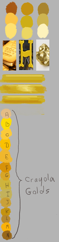
Below is the image I sent to look for clarification on what he was looking for. you’ll notice the gold I used in the title with it’s color extracted, between a gold bar(warm red brown shadows) and a gold ore(cool olive green shadows). You’ll find in most photos gold is depicted as being the warm orange red but when painting it can be very effective to use a pale yellow green. In a mostly warm pallet painting this will let the gold feel heavy, cold, and a little more aged.
I also included in the image a list of color swatches. The top dot “A” is crayola’s original gold, and then the rest are alternative golds that crayola released. Using this set of examples and finding out how metallic he wants it to appear, I feel like I can accurately interpret what the client means when they ask for the element to be more gold. I’m going to be doing an exercise to explore metallic surfaces for my next post. I’ll be doing gold, silver, iron, and copper spheres depicted under a couple different lighting set ups.