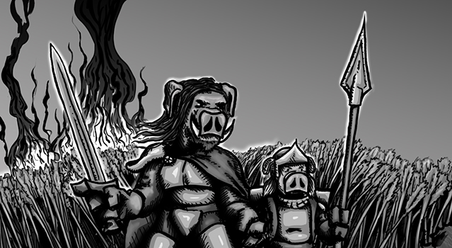
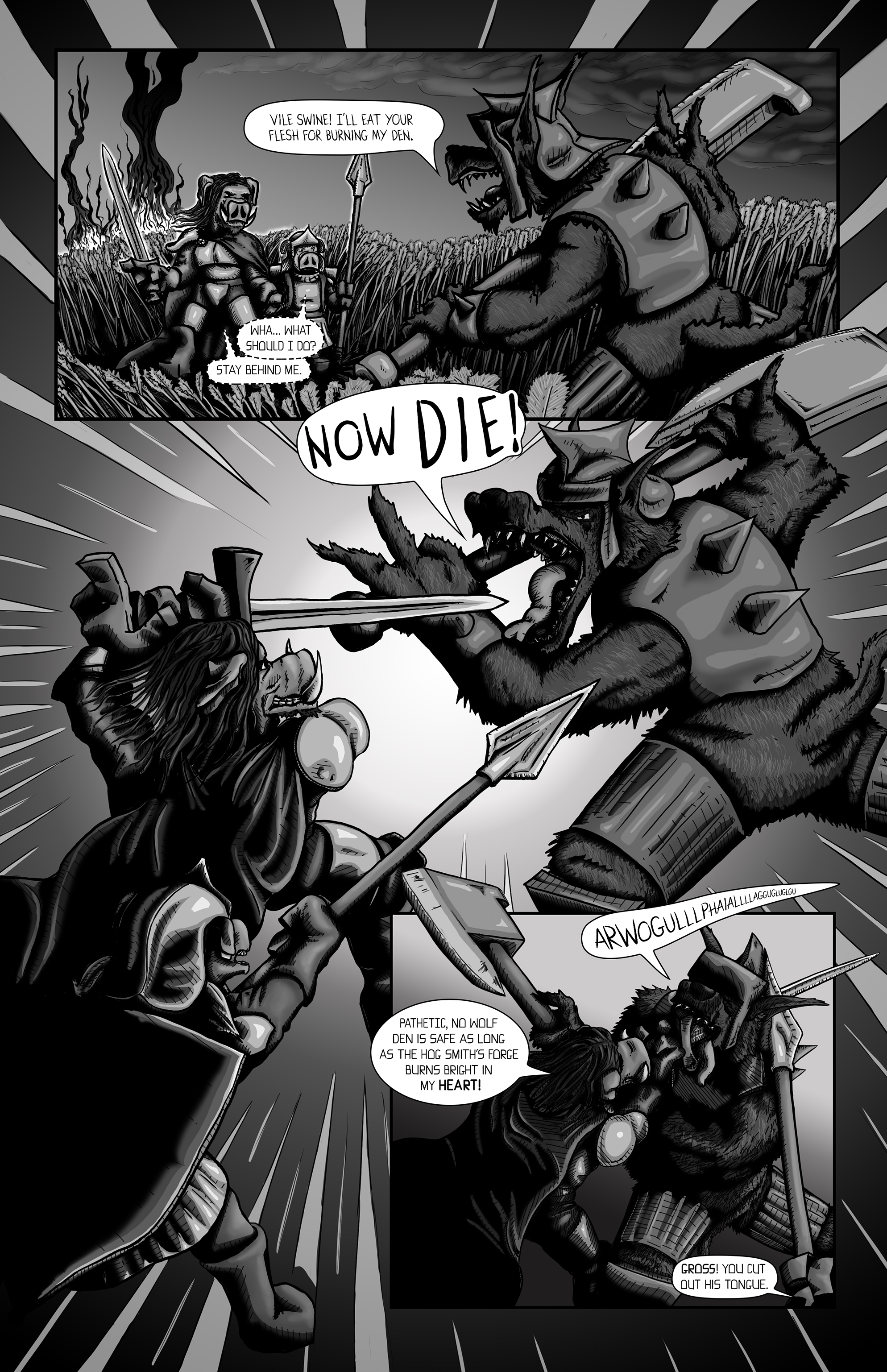
Context is everything, the two comic book fonts I created looked nice in my last post, but they weren’t in word balloons or on a comic book page. So I dropped them into a page I made to get accustomed to my Cintiq Companion 2, as well as exploring the overall look and style I wanted to achieve. Already I can see some adjustments need to be made to the fonts, especially for low resolution situations.
Got any critiques or suggestions, let me know in the comments below.