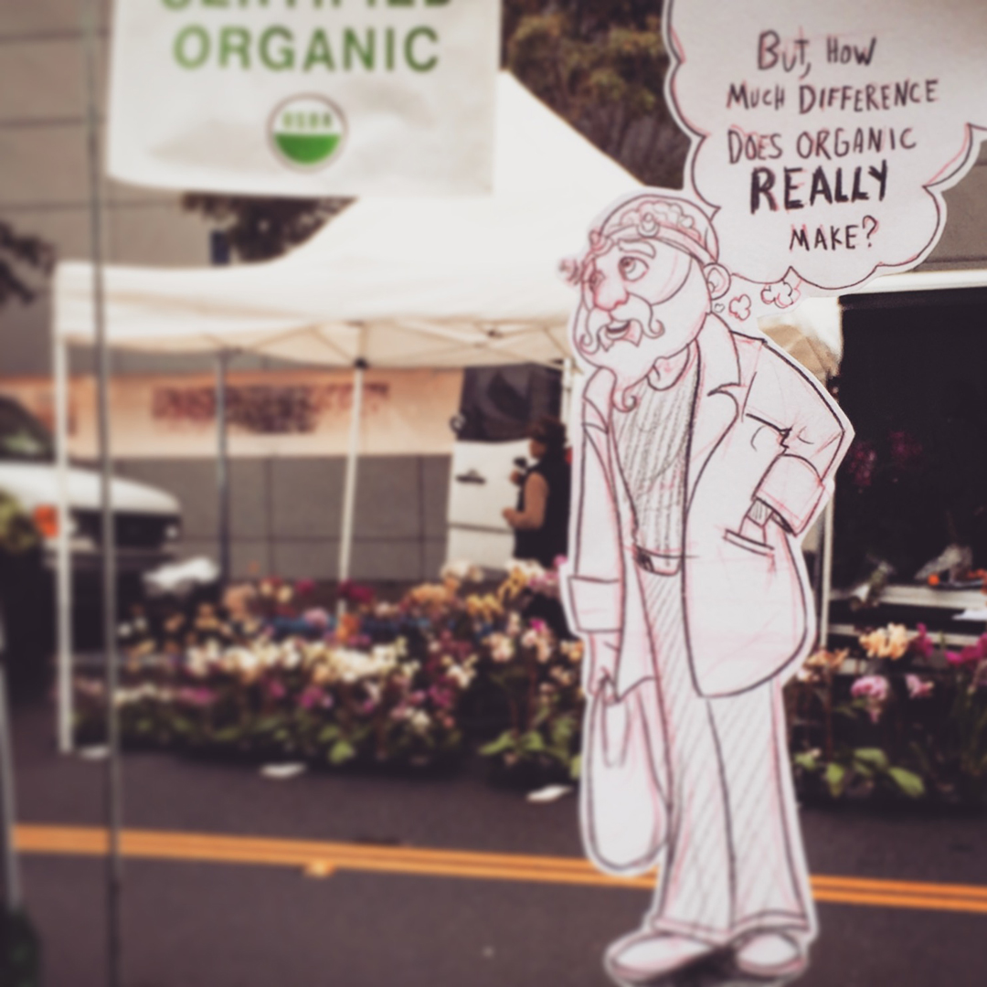
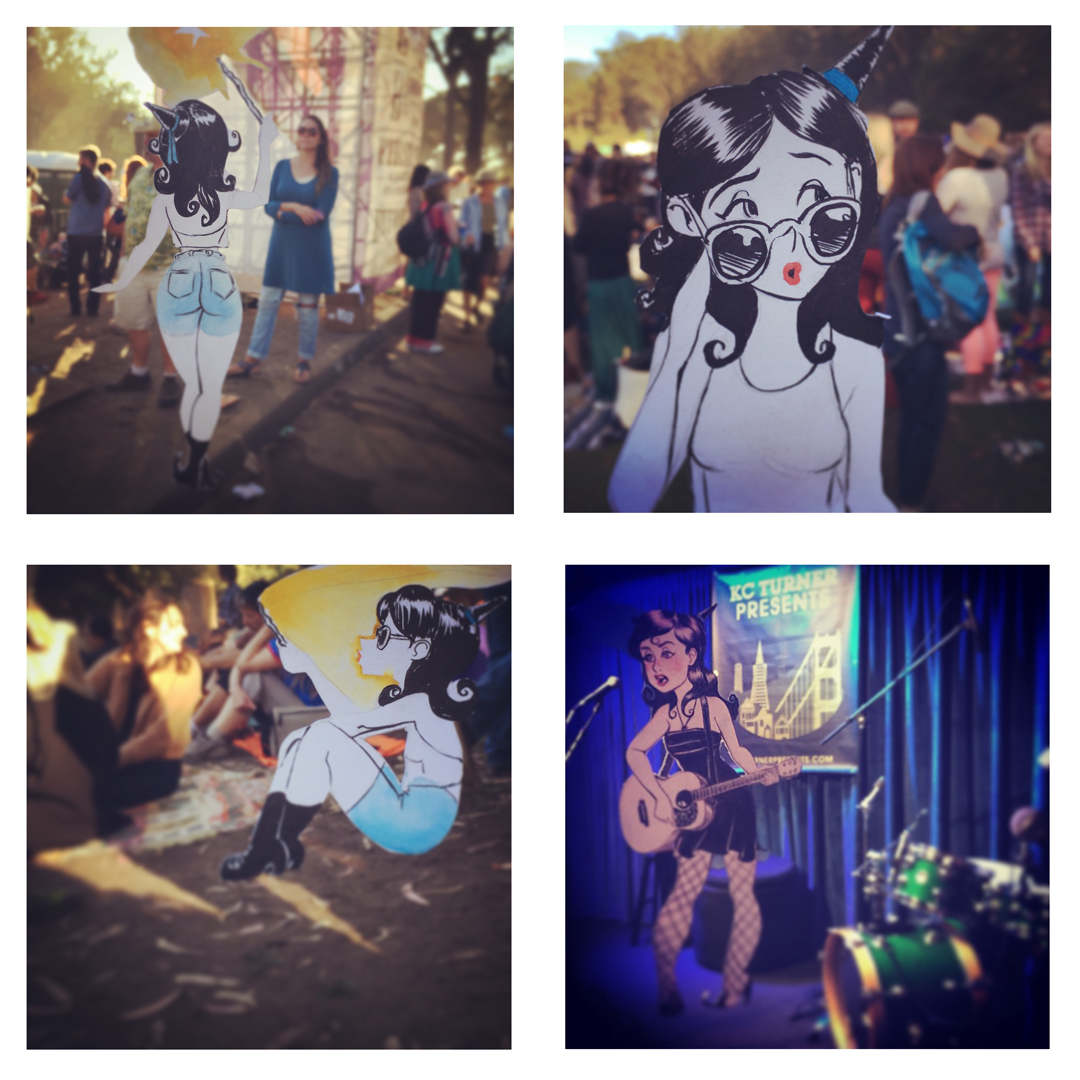
One of my favorite sketch projects over on Instagram is a series I call “Forced Perspective Comics” (@Joshings if you’re curious)
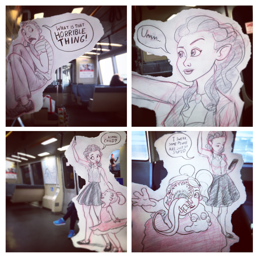 These vary in complexity from simple multipart comic stories
Series dedicated to a single character
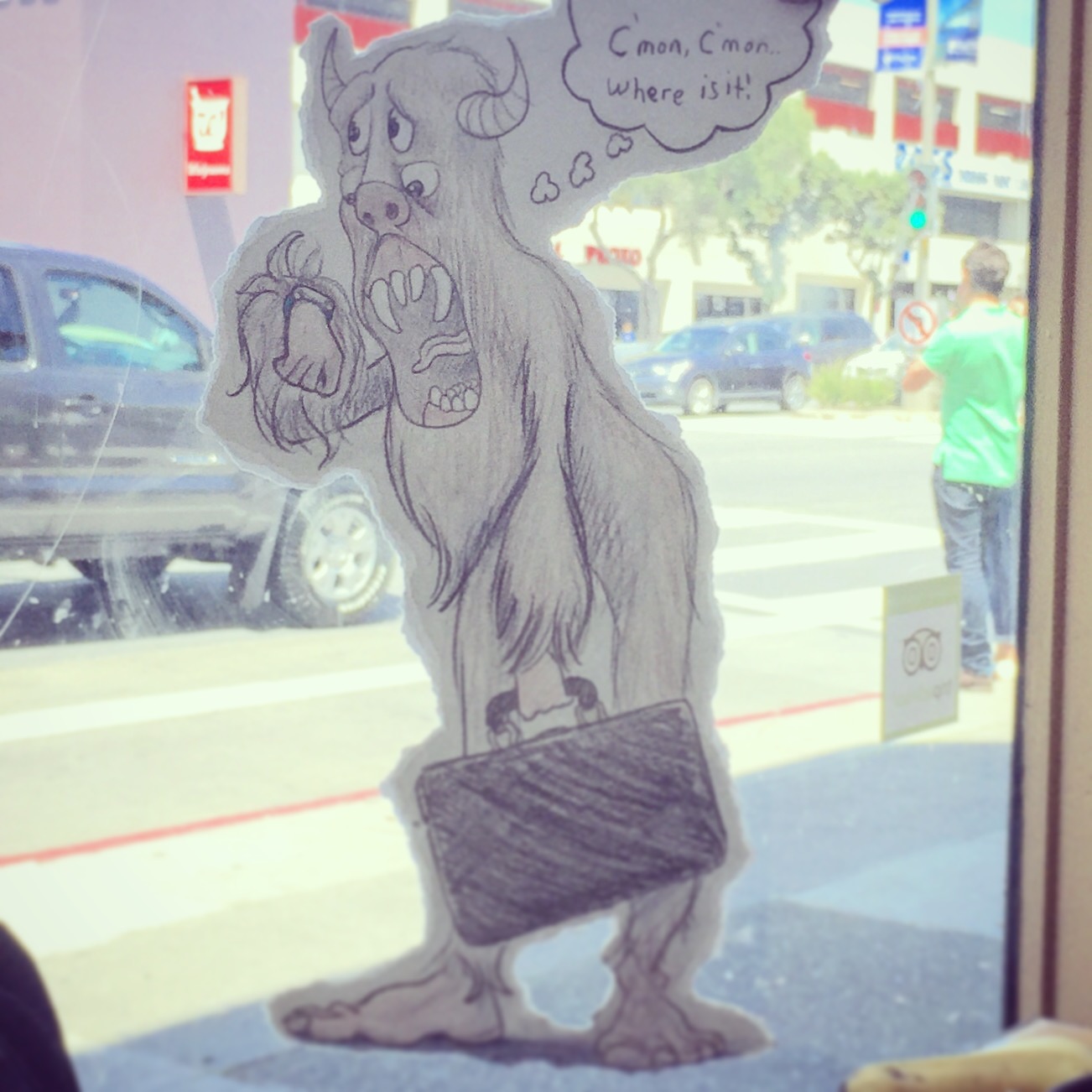
or one off images created in a moment of inspiration.
This series was inspired by films like “Who Framed Roger Rabbit” and “Cool World” and specifically by the work of Marty Cooper aka Hombre_McSteez
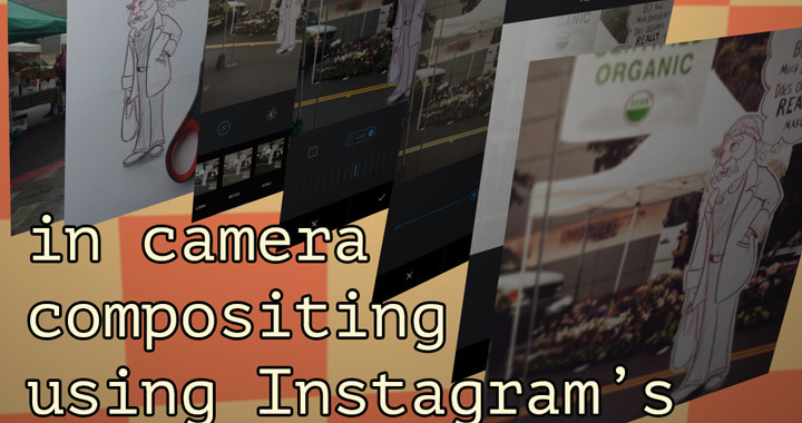
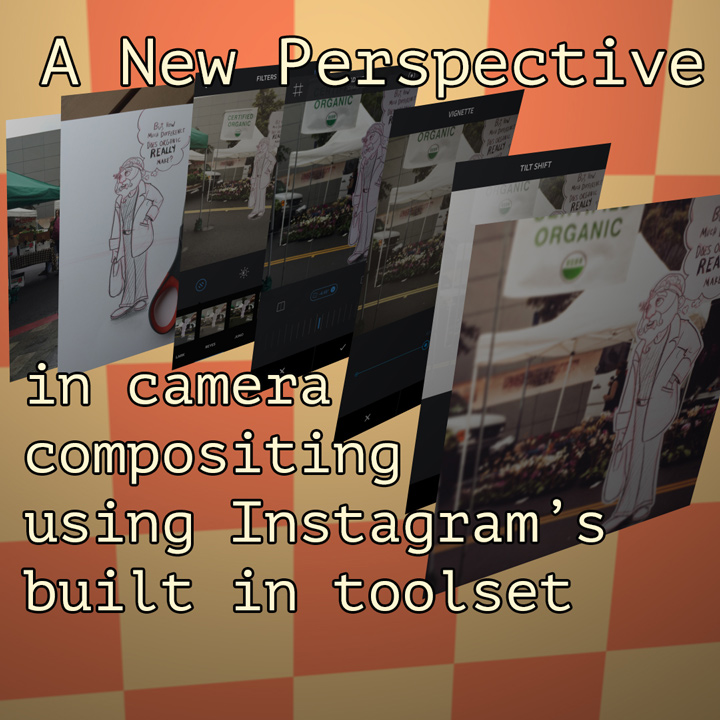
Making these images takes a few relatively easy steps.
1 – Location Location Location
find a spot that inspires you to draw. Is there something entertaining that could be happening here?
2 – Give yourself a little guidance
Do a quick guide sketch of the space where you character will stand/sit etc. Try to be accurate, but don’t sweat it too much
3 – Sketch the character
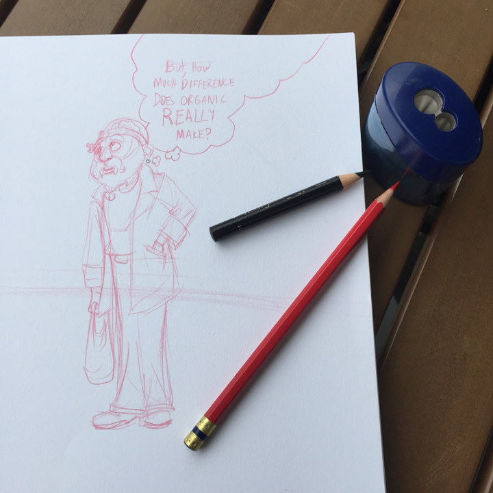
use your guide sketch to check proportions, and hold the drawing up to eyeball how its fitting into the shot
4 – Put finishing touches on the drawing, and cut/rip it out
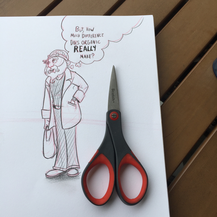
this is much easier when you have scissors. I try to hide my hand, so I tend to use artfully cropped characters or word balloons against a border edge as an extended tab to grab on to
5 – Take some pictures, choose the best one
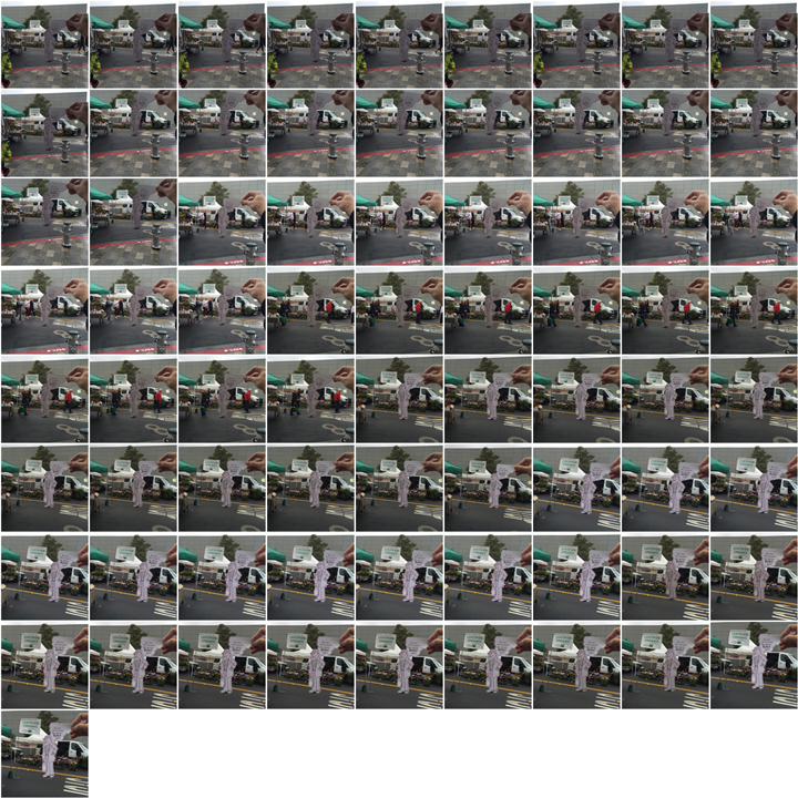
it can be tricky to get the perfect shot. Wind Blows, people walk into your frame, you misalign the elements. Try moving your body forward if your character is too large and your arm is extended as far as it will go. If the character is too small and everything feels too blurry try taking a step back.
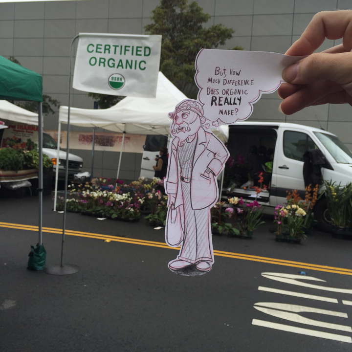
6 – Filter!
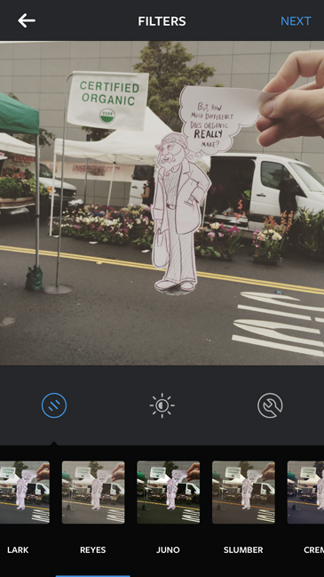
Instagram’s built in filters give your food paintings that je ne sais quoi of analog flaws. It doesn’t really help us improve our drawings at all, but we can piggy back on the results. These look filters have a unifying effect on the over all color scheme, so black and white cartoon characters start to feel like they’re in the same lighting space as the actual photographed world. Its a subtle effect sometimes, but can help a lot. I spend a lot of time choosing the filter that creates the most harmonious relationship between background and foreground.
7 – Crop
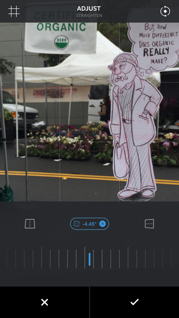
Crop out your hand and try to get the feet to sit nicely on the ground. It is often at this step that I find I need to make small adjustments to my drawing and re-shoot the photo
8 – Adjustments
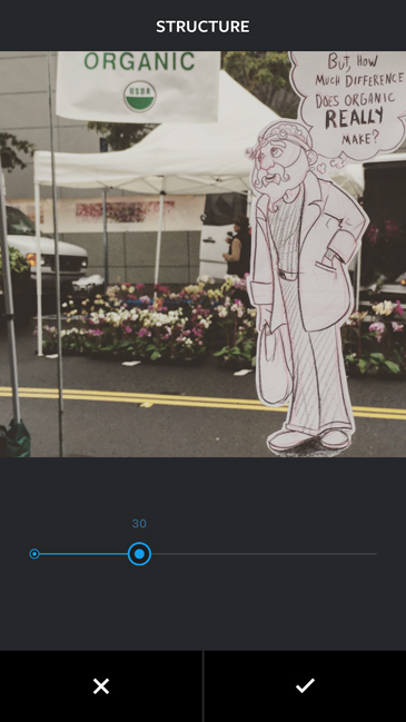
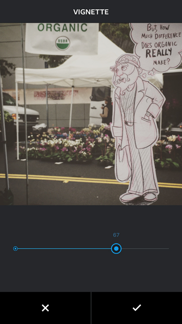
Add any adjustments that help cement the relationship. This could mean nothing or fiddling with every slider in the app. I do tend to use the vignette pretty consistently at this stage.
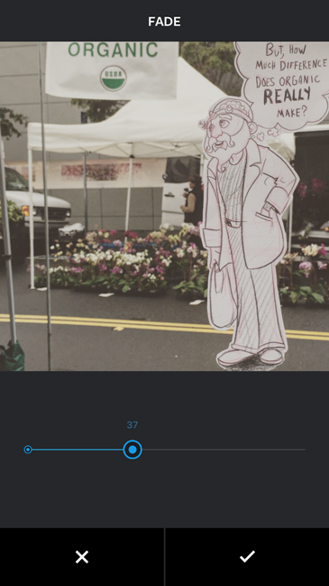
9 – Tilt Shift <- very important
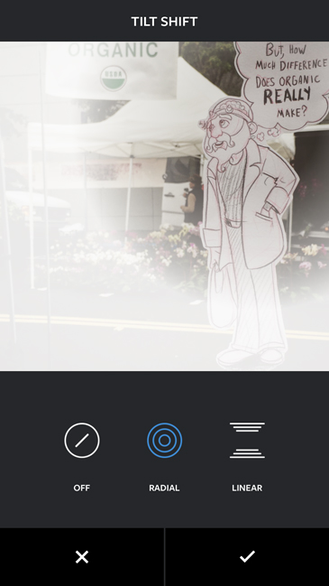
Tilt shift is a photographic technique that makes objects look tiny by simulating an extremely narrow depth of field. It does this by blurring large sections of the image. You can accomplish this in the analog with extremely expensive lenses, painstaking hours in the dark room, or digitally using 3 clicks in instagram. We don’t use the filter to make things look small, we are trying to fight one of the biggest give aways that our character is not in the real world. The iphone (or android) camera adjusts its aperture automatically responding to the amount of light in the area. This can make it extremely difficult to control the depth of field. Ideally you would use a very high f.stop, aka tiny aperture and a lot of light so your little piece of paper and background would both be in crisp focus. Since this doesn’t usually happen I push for more blurriness selectively applied to help glue the images together. If you use the radial tilt shift filter you can keep the face/focal point of your drawing in focus and blur the contact point in a way that matches the blur of the background photo.
Final!