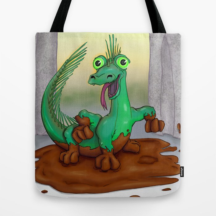
- The Young Basilisk named Fennel
- Mermaid Encounter
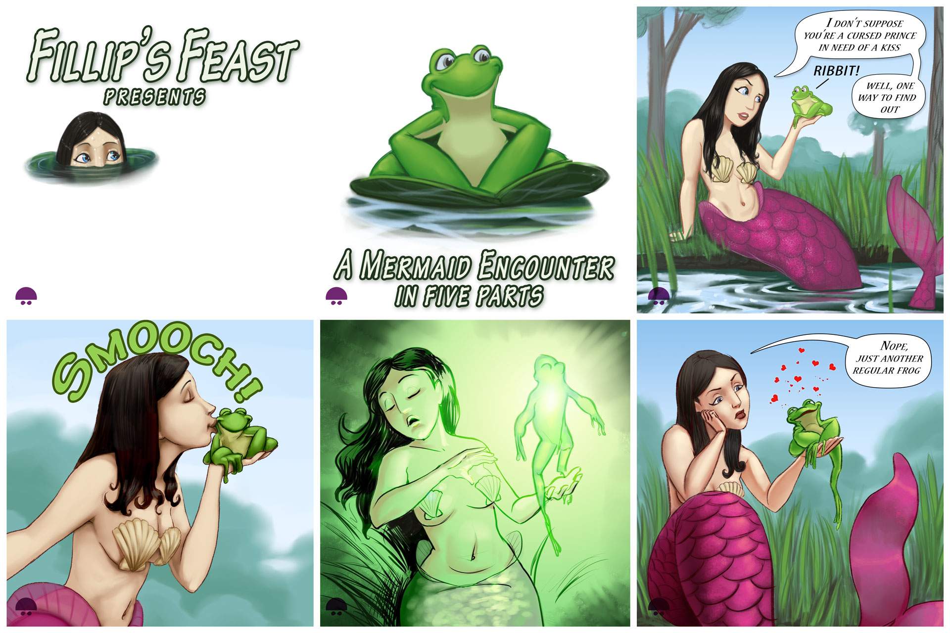
Here it is the full comic as one image! thanks for coming along the mermay journey with us!
Continue reading → - Reassuring Smile: Applied Learning
Anyone who has spent any time studying art quickly learns one inevitable truth about the profession. You never, ever, stop practicing, learning and improving. From the tiny baby pasting their first piece of colored macaroni onto construction paper, to the master painter who has been practicing daily his whole life.
So you keep working, and keep working and hope that you are improving. You finish a piece and look at it… and you hate it. A few days later you come back to it and decide it’s the best piece you’ve ever done. 6 months later, it’s still not bad, but now you can see all the flaws you didn’t spend enough time working on. And so the process goes. But as your observing, studying and learning from others it’s helpful to take a step back, pick a few techniques and work on applying them to your next piece.


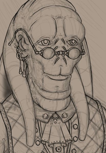
For this piece, “Reassuring Smile” I decided to apply some methods from one of my favorite artists, James Gurney. As well as some new techniques I’ve been learning from Aaron Blaise’s tutorials.

Specifically I’m applying James Gurney’s method of creating a simple model for reference, and lighting it to fit the scene your working on. I’m also using a palette I developed digitally based on his oil painting pallet techniques laid out in his book “Color and Light.” Which I highly suggest to painters just starting out.

As it turned out, my process is already very similar to Aaron Blaise’s. But I wanted to try out using some of his photographic texturing techniques and applying just a little bit of depth of field to give the piece a more photographic feel.
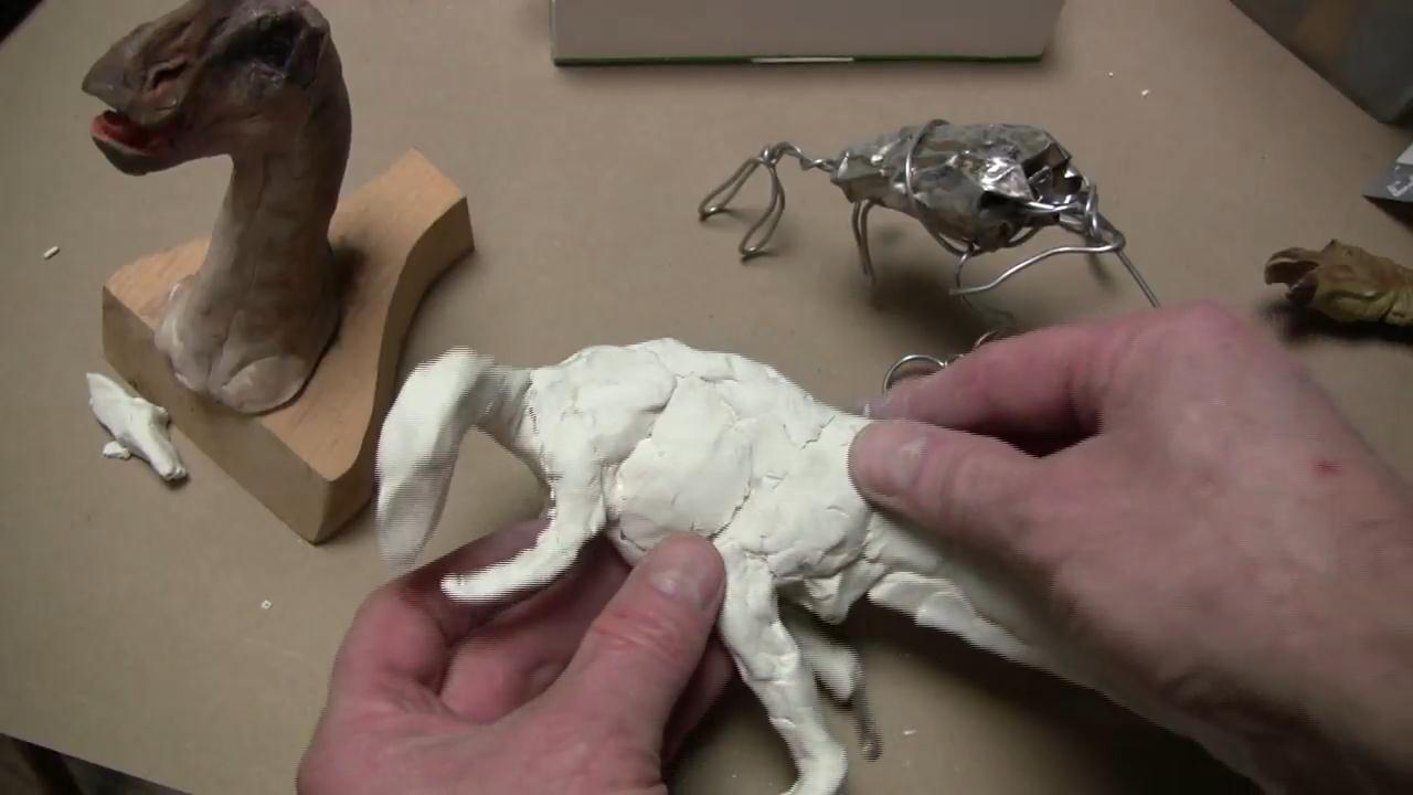
I build out my model, and I cross light it with a candle from the bottom left and a blue light from the top right to give it the feel of fire in the room and moon light coming through a window. I work on the sketch and model at the same time, trying to get my model to have the major parts defined but not worrying to much about the little details.
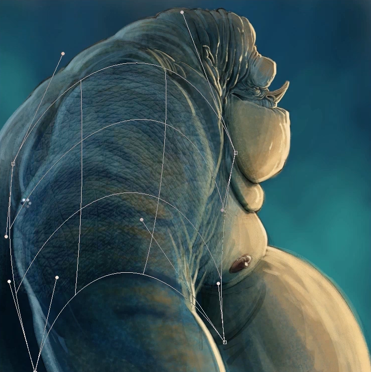
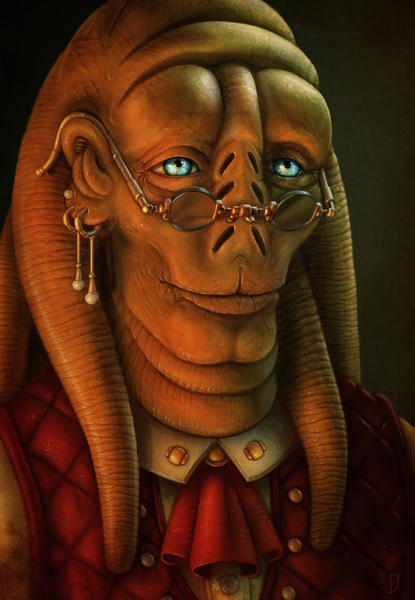
After I lay in my flats and build out the basic color and lighting I’m ready to start detailing and blending. I tend to get all my color laid in from my pallet and then pick the color from the image to paint in the final strokes.
I get everything cleaned up and it’s time to apply Aaron’s photographic texturing technique
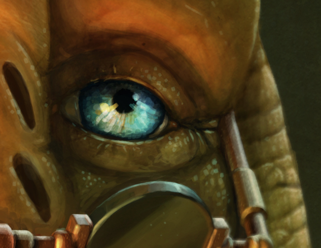
With all the textures laid in and quite a few clean ups and shifts to improve the image. now it’s time for some final shadows and highlights.
Finally I use a bit of a grunge texture to create a vignette to the over all feeling of the image as well as using the smudge tool with a soft round brush to blur my back edges to add the depth of field.
I was hoping to have an idea of how long total I spent on this but unfortunately I was working on it while moving from Boston to Norther Virginia, so I’ll give you a timeline on the next one I do.
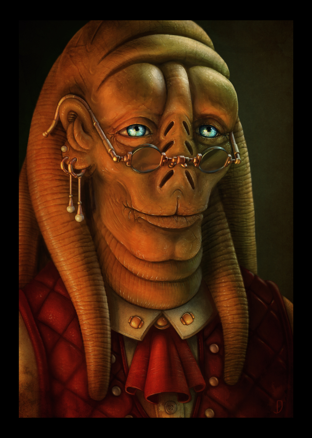
And finally a larger version of the finished Image.
Continue reading → - Seeing a new Perspective
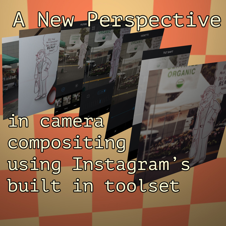
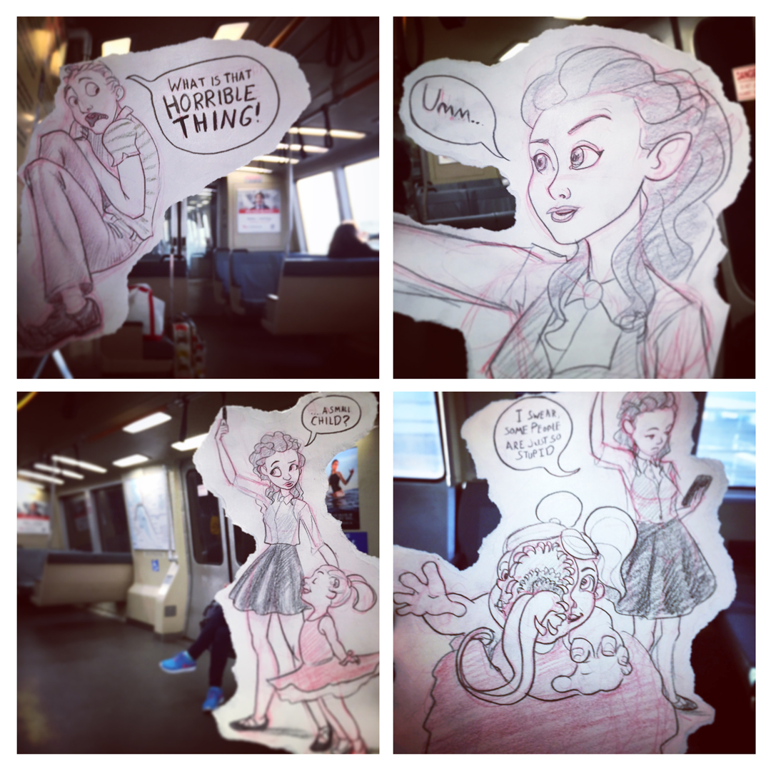
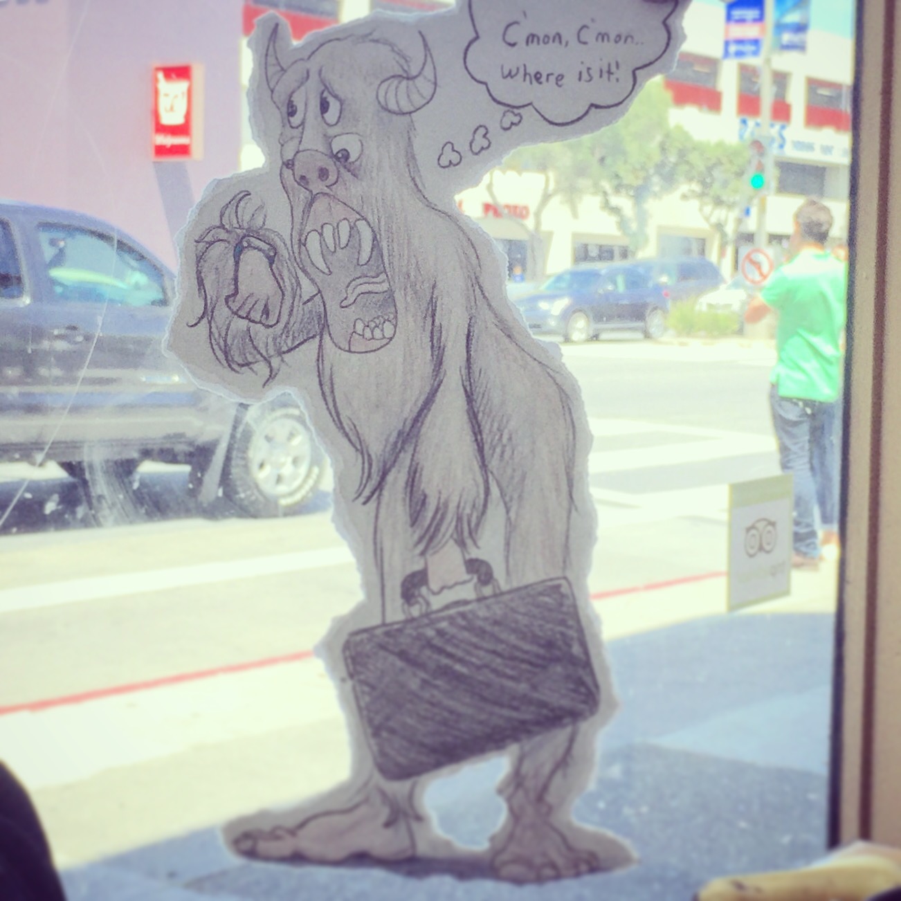
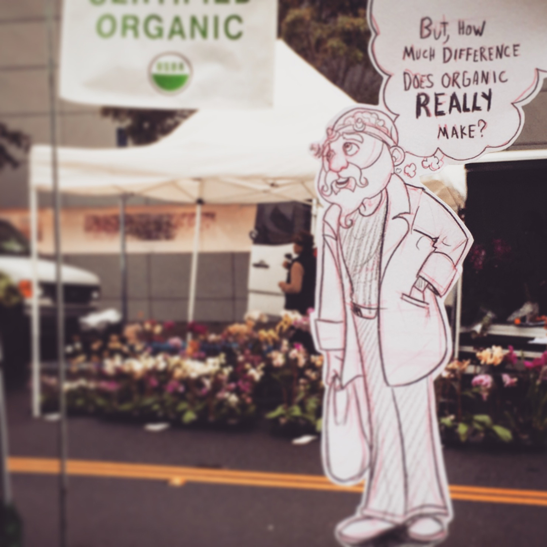
One of my favorite sketch projects over on Instagram is a series I call “Forced Perspective Comics” (@Joshings if you’re curious)
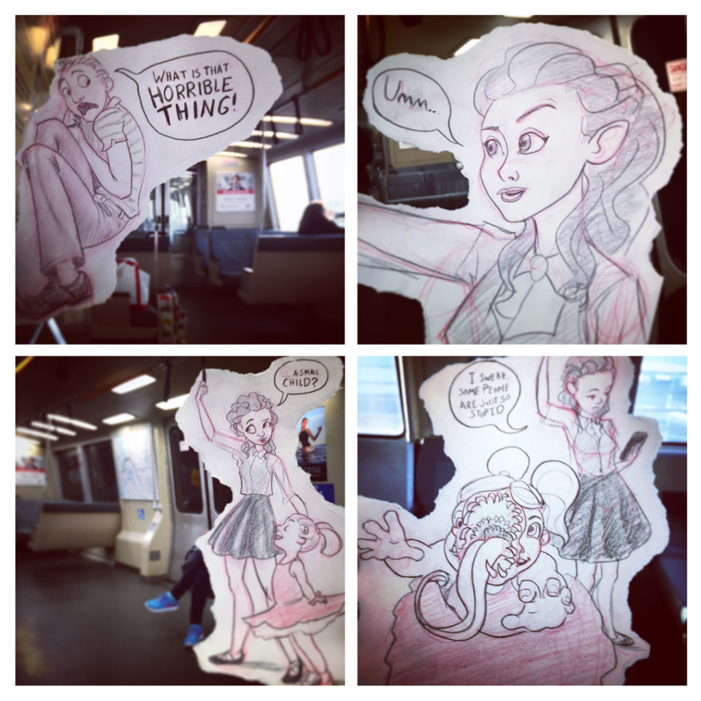 These vary in complexity from simple multipart comic stories
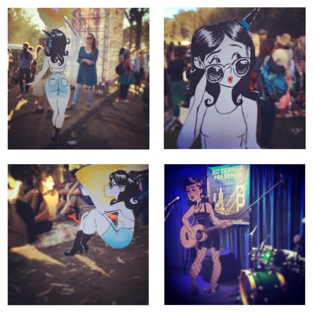
Series dedicated to a single character

or one off images created in a moment of inspiration.
This series was inspired by films like “Who Framed Roger Rabbit” and “Cool World” and specifically by the work of Marty Cooper aka Hombre_McSteez
Making these images takes a few relatively easy steps.
1 – Location Location Location
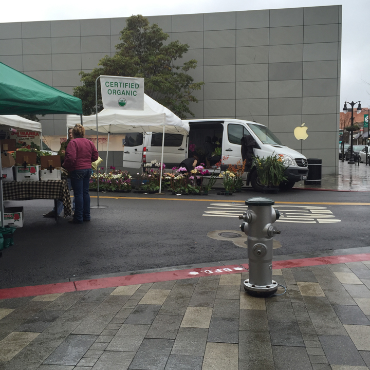
find a spot that inspires you to draw. Is there something entertaining that could be happening here?
2 – Give yourself a little guidance
Do a quick guide sketch of the space where you character will stand/sit etc. Try to be accurate, but don’t sweat it too much
3 – Sketch the character
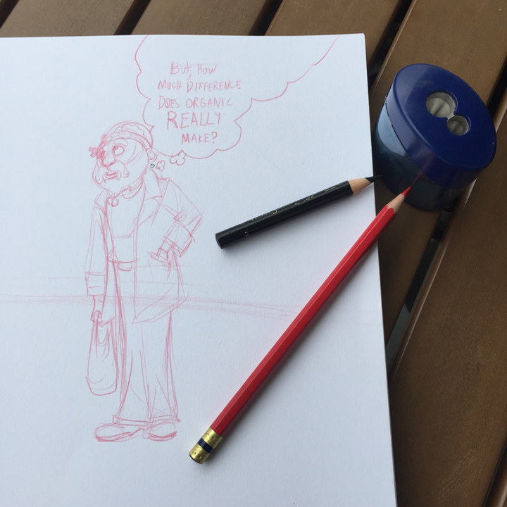
use your guide sketch to check proportions, and hold the drawing up to eyeball how its fitting into the shot
4 – Put finishing touches on the drawing, and cut/rip it out
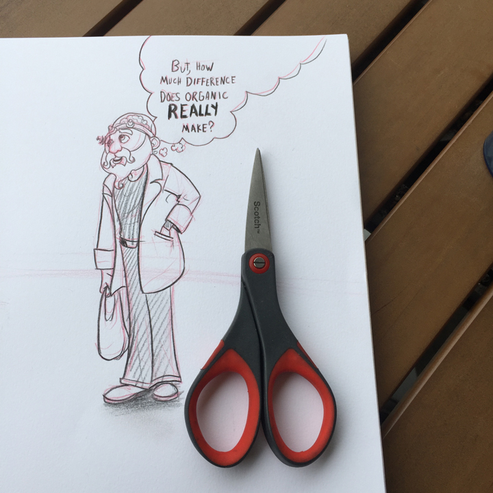
this is much easier when you have scissors. I try to hide my hand, so I tend to use artfully cropped characters or word balloons against a border edge as an extended tab to grab on to
5 – Take some pictures, choose the best one
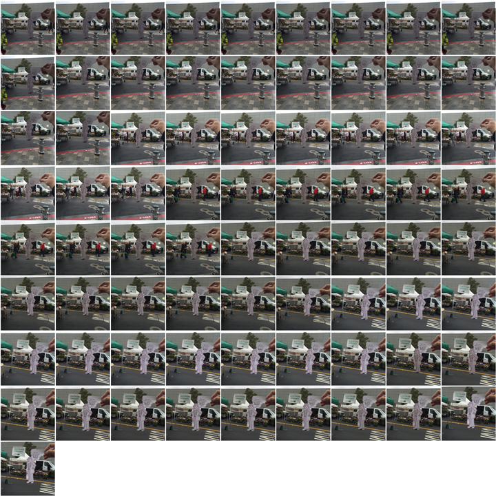
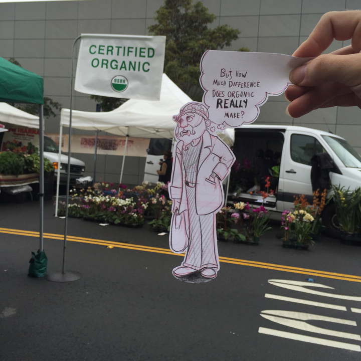
it can be tricky to get the perfect shot. Wind Blows, people walk into your frame, you misalign the elements. Try moving your body forward if your character is too large and your arm is extended as far as it will go. If the character is too small and everything feels too blurry try taking a step back.
6 – Filter!
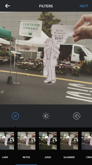
Instagram’s built in filters give your food paintings that je ne sais quoi of analog flaws. It doesn’t really help us improve our drawings at all, but we can piggy back on the results. These look filters have a unifying effect on the over all color scheme, so black and white cartoon characters start to feel like they’re in the same lighting space as the actual photographed world. Its a subtle effect sometimes, but can help a lot. I spend a lot of time choosing the filter that creates the most harmonious relationship between background and foreground.
7 – Crop
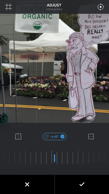
Crop out your hand and try to get the feet to sit nicely on the ground. It is often at this step that I find I need to make small adjustments to my drawing and re-shoot the photo
8 – Adjustments
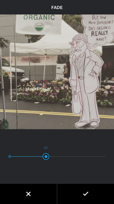
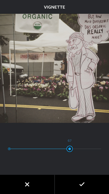
Add any adjustments that help cement the relationship. This could mean nothing or fiddling with every slider in the app. I do tend to use the vignette pretty consistently at this stage.
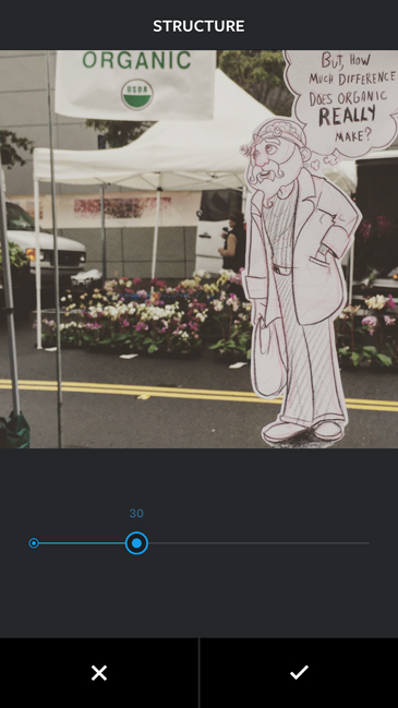
9 – Tilt Shift <- very important
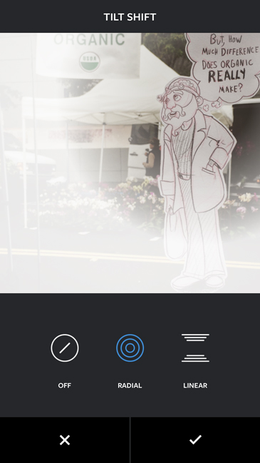
Tilt shift is a photographic technique that makes objects look tiny by simulating an extremely narrow depth of field. It does this by blurring large sections of the image. You can accomplish this in the analog with extremely expensive lenses, painstaking hours in the dark room, or digitally using 3 clicks in instagram. We don’t use the filter to make things look small, we are trying to fight one of the biggest give aways that our character is not in the real world. The iphone (or android) camera adjusts its aperture automatically responding to the amount of light in the area. This can make it extremely difficult to control the depth of field. Ideally you would use a very high f.stop, aka tiny aperture and a lot of light so your little piece of paper and background would both be in crisp focus. Since this doesn’t usually happen I push for more blurriness selectively applied to help glue the images together. If you use the radial tilt shift filter you can keep the face/focal point of your drawing in focus and blur the contact point in a way that matches the blur of the background photo.
Final!
Continue reading →
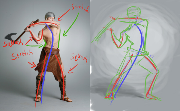
- How do you figure episode 3: Using Line of Action to identify Exaggeration Opportunities
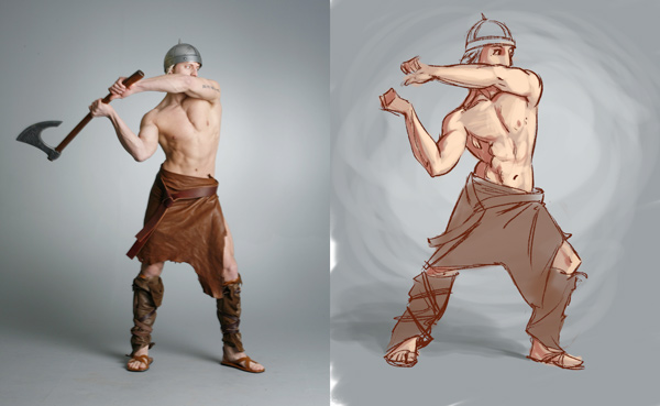
Today we’re building off of the concepts in a previous How do You Figure episode (see here) and will talk about using line of action to exaggerate our poses.
I’m working off of a stock photo from Marcus J Ranum, a photographer who provides amazing resources for artists mostly for free, check out his deviantart for great stock photos.
This character is swinging his axe, moving from left to right, I’m going to attempt to enhance the feeling of power in the axe swing.

I’ll start by identifying the primary line of action, a curved line that shows the tension of the spine and the direction of the force. In my study drawing we can exaggerate the feeling of these forces by leaning the line further to the right and bending the line in the torso further
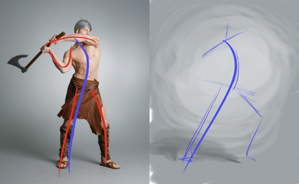
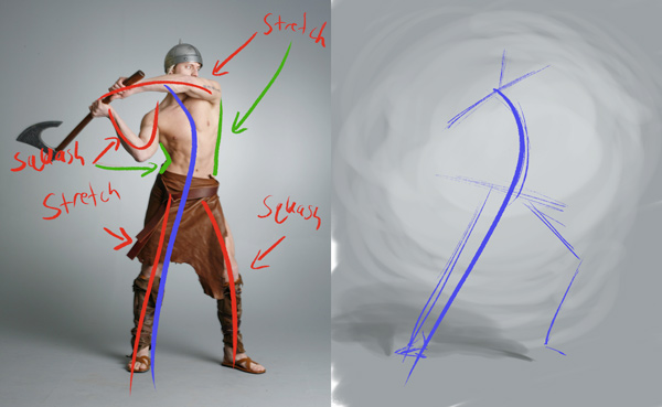
I find it helpful to think of the other limbs as having their own lines of action, often providing counter motion to the primary line of action.
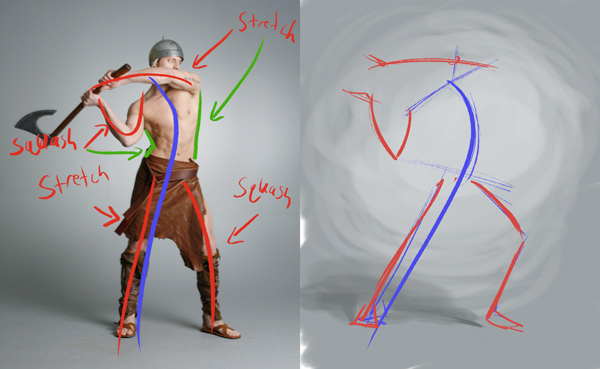
The exaggeration opportunity here is often in the squash and stretch, and their relationships with the primary line of action. Adjusting slightly to avoid right angles can make the pose feel more organic.
From there the study is finished off using a few layers of sketching
block in
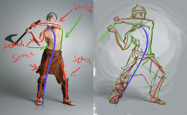
clean line
tones/painting.
each of these other steps have their own shortcuts to get to a finished state more efficiently, but that’s for another blog post.
Continue reading → - Turkey Day
- The Three Little Pigs: Font Dev and Style
Context is everything, the two comic book fonts I created looked nice in my last post, but they weren’t in word balloons or on a comic book page. So I dropped them into a page I made to get accustomed to my Cintiq Companion 2, as well as exploring the overall look and style I wanted to achieve. Already I can see some adjustments need to be made to the fonts, especially for low resolution situations.
Got any critiques or suggestions, let me know in the comments below.
Continue reading → - An Isometric Point of View
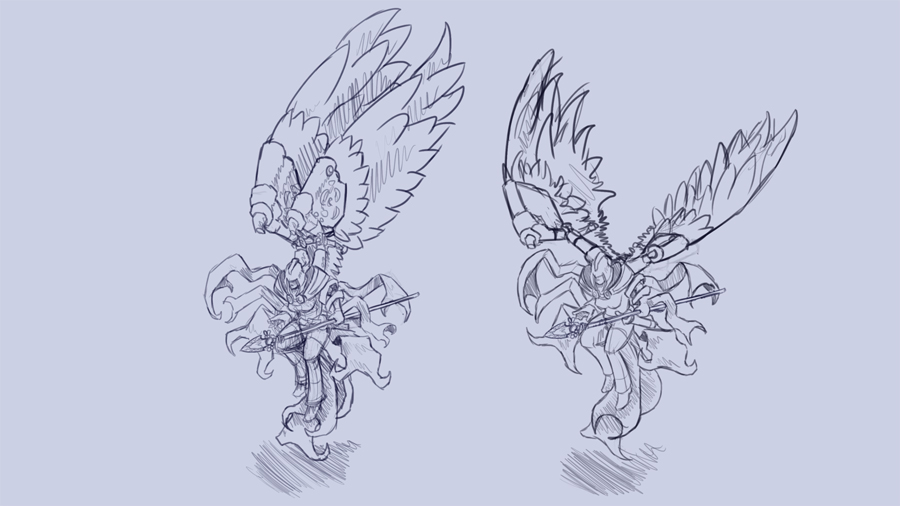
 As I’ve been thinking about future game possibilities for our company, I’ve become enamored with the isometric point of view. This is when basically you design the point of view of your game from a top down angle where the grid for your ground plane forms parallel lines.
You see this point of view in the smallest independent games all the way up through major platform releases like the Diablo series from Blizzard.
As I’m working on the concepts for games, I’m also performing a series of exercises to get my self thinking from this point of view.
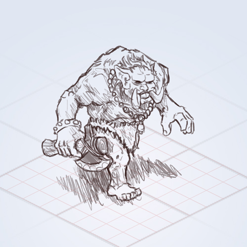
Everything from doing throw away thumb nail and silhouette sketches to trying to design how architecture can be rendered so it feels dynamic but doesn’t block your point of view.
Here is a look at one of the exercises I’m working on. Staring with a concept sketch.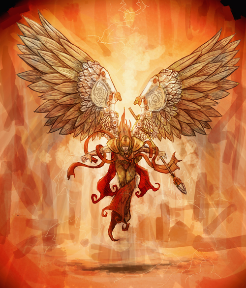
After developing the character in a hero pose, if I was developing this character fully there would be a break down of different angles and behaviors, clothing, equipment and variations. But in this exercise I’m predominately concerned with developing an idle pose that works on an isometric grid. Because I’ve made it a flying character that pose can be fairly dynamic with the wings flapping to keep them in the air.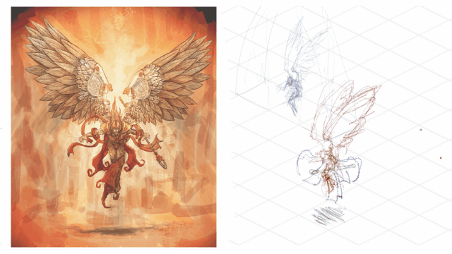
I’ve also started trying to figure out the detail I can put into the character with out slowing down my animation process or letting the character get so busy that it’s hard to read from far away. In this case, the sketches I’ve started I are too detailed for the end goal. While I like the design, given our workflow, it takes too much time to draw, and the features need to be simplified.
As I’m working of this point of view and the challenges and opportunities it presents, I start thinking about some of the art I’ve already done. I wonder for instance how difficult it would be to take a concept like this and translate it into a playable isometric scene.
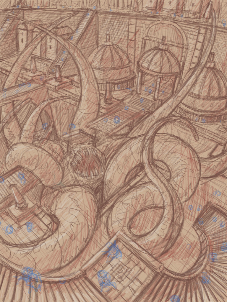
Over all it’s an extremely interesting way to be thinking about game design and I know I’m just scratching the surface of possibilities.
Continue reading → - The Three Little Pigs: exercise in font creation
As part of an upcoming project, a graphic novel loosely based on the Three Little Pigs, I’ve been developing several fonts. The two fonts I’ve completed so far are comic book speech bubble fonts. As an exercise and to try out my new fonts I’ve rewritten the original Three Little Pigs fairy tale using my pig and wolf speech fonts for their respective parts in the story.
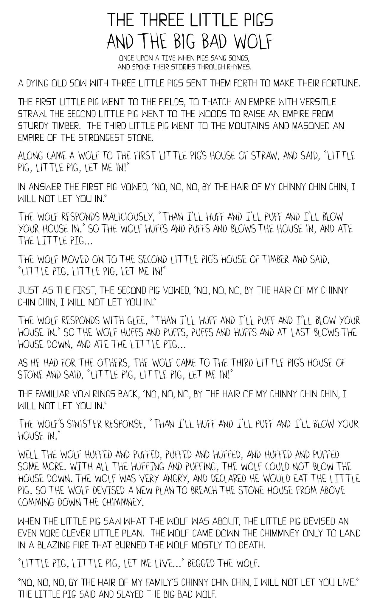
When creating these fonts I began with research, I found the advice in The DC Comics Guide To Coloring and Lettering Comics by Mark Chiarello and Todd Klein to be very useful. Even though I’ve made a computer font, I wanted the font to have a hand lettered feel. To this end I created a single case font where the upper and lower case versions would be slight variations of the same glyph. I also sought the advice of my friends and designers who had more experience creating fonts than myself. They directed me to create several design goals, the look and feel, that I wanted the font to convey. The pig’s Font I wanted to be structured and grounded, to reflect the buildings they make and their stern vows. The wolf’s font I wanted to be sharp and fierce, to reflect the killer instinct and sinister intent.
Continue reading → - How Do You Figure: Episode 2, building shortcuts
Figure drawing for illustration can be broken up into roughly 3 basic topics. Structure, Line and form. All three are intertwined, but each can be practiced independently. Today we’ll talk about the first two topics. In all of these things, generally you can start with a circle.
Professional artists can be deceptive in their work. When Eric Goldberg seems to wave his pencil like a magic wand and reveals perfectly placed lines almost every time, it can feel like that’s the way to start drawing characters. But the secret is that under the disturbingly perfect lines is a measured structural drawing he’s already worked out in his head. Goldberg has such a refined sense of proportion and motor control that he can jump straight to the lockdown line, especially on a character he’s spend multiple years drawing animation drawings of. But when he teaches you how to draw in his book Character Animation Crash Course! he starts with a circle
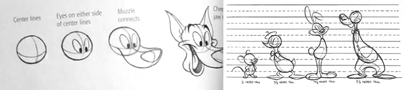
Seriously, just go buy the book, its amazing.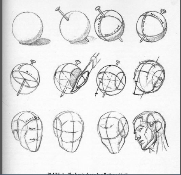
Andrew Loomis gives a solid formula for constructing a generic white guy human head in his series of illustration books including Figure Drawing for All its Worth, and Drawing the Head and Hands. It should come as no surprise that he starts with a circle. The next 2 lines unlock the secret though. The center line of the face, and the brow line. These two lines provide the structure that you can build the rest of the face and head on and the head is the best way to measure out the rest of the body easily.
The shortcut to drawing freehand is to be able to visualize the underlying structure before you put pen to paper. The downside is there is no shortcut to internalizing that structure, you have to practice. So draw people, but only draw the construction lines, circle, center, brow. Draw from life, draw from movies, draw from the mirror, get the proportions into your hands and head till it takes no effort.
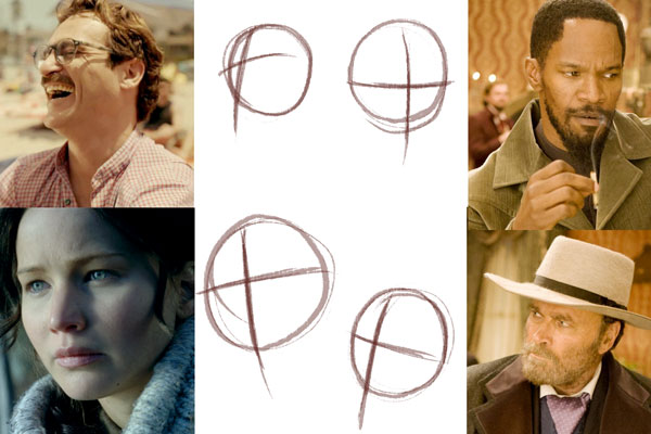
movie credits: Her, Hunger Games, Django UnchainedAnd note, drawing final lines freehand shouldn’t even be your goal necessarily. Its a fun party trick, it can come in handy if you’re doing reportage, but many artists continue creating construction drawings before locking down the final line through their entire career. Case in point: Glen Keane, who seems to carve the shape from the paper, stroke by stroke, laying down construction lines whenever necessary before locking down.
Continue reading →